Contact Us

Public Speaking
Video not working? Go to https://www.youtube.com/watch?v=wB2zIwahaiE.
Posters
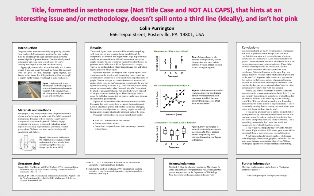
Posters are often used as an accompaniment to a talk or presentation, or as a substitute. You’ve probably seen posters hanging up around campus, showcasing students' research. The idea of a poster is to simplify a study and present it in a visual way, so it can be understood by a wide audience. The most important thing to remember when designing a poster (or completing any kind of published work) is to follow the guidelines given. If your instructor, or the conference you’re presenting at, wants a certain format, adhere to that format. These three rules are especially important to follow:
- Shorter is better: make sure that your poster does not contain too much text! Packing text onto the poster makes it difficult to read and understand.
- Bigger is better. No, this is not a contradiction of rule 1! Make sure your text is large enough to read, and readable against the background of the poster.
- Use images. The key aspect of a poster is that it is a visual medium. Include graphs, photos, and illustrations of your work.
Here are some excellent tips and templates for research posters:
1. http://colinpurrington.com/tips/academic/posterdesign
2. https://ph.byu.edu/resources
![]()
3. https://pop.psu.edu/sites/pri/files/Poster%20Design%20Tips.pdf: Poster tips from Penn State